前端数据可视化实践:基于ECharts与Element Plus的统计仪表盘实现
本文记录了使用 Element Plus 和 ECharts 库在前端实现数据可视化的学习过程。针对销售场景的需求,构建了一个包含概览统计、漏斗图和饼图的仪表盘。该过程强调从静态原型到动态数据渲染的逐步迭代,帮助读者快速上手类似开发。
概览统计模块
概览统计模块用于展示关键指标的汇总视图,例如活动数量、线索和客户统计。该模块采用 Element Plus 的 Statistic 组件,实现响应式布局和自定义标题/后缀显示。
1. 引入组件
参考 ,基本结构如下:
<el-row :gutter="16">
  <el-col :xs="24" :sm="12" :md="6" class="text-center mb-4">
    <el-statistic title="Daily active users" :value="268500" />
  el-col>

el-row>
2. 自定义组件
根据需求调整为销售相关指标,支持动态数据绑定和自定义模板:
<el-row :gutter="16">
  <el-col :xs="24" :sm="12" :md="6" class="text-center mb-4">
    <el-statistic :value="summaryData.effectiveActivityCount">
      <template #title>市场活动template>
      <template #suffix>/{{ summaryData.totalActivityCount }}template>
    el-statistic>
  el-col>
  <el-col :xs="24" :sm="12" :md="6" class="text-center mb-4">
    <el-statistic title="线索总数" :value="summaryData.totalClueCount" />
  el-col>
  <el-col :xs="24" :sm="12" :md="6" class="text-center mb-4">
    <el-statistic title="客户总数" :value="summaryData.totalCustomerCount" />
  el-col>
  <el-col :xs="24" :sm="12" :md="6" class="text-center mb-4">
    <el-statistic :value="summaryData.successTransactionAmount">
      <template #title>交易总额template>
      <template #suffix>/{{ summaryData.totalTransactionAmount }}template>
    el-statistic>
  el-col>
el-row>
在 Vue 组件中定义数据和加载逻辑:
data() {
  return {
    summaryData: {
      effectiveActivityCount: 0,
      totalActivityCount: 0,
      totalClueCount: 0,
      totalCustomerCount: 0,
      successTransactionAmount: 0,
      totalTransactionAmount: 0,
    },
  };
},
mounted() {
  this.loadSummaryData();
},
methods: {
  loadSummaryData() {
    doGet("/api/summary/data", {}).then((resp) => {
      if (resp.data.code === 200) {
        this.summaryData = resp.data.data;
      }
    });
  },
},
添加辅助样式以确保居中对齐:
.el-row {
  text-align: center;
}
3. 后端数据接口
前端实现完成后,等待后端提供 /api/summary/data 接口,返回匹配的 JSON 结构。

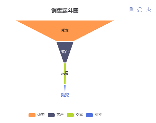
漏斗图模块
漏斗图适用于展示销售流程的转化路径,例如从线索到成交的递减关系。该模块基于 ECharts 的漏斗系列(funnel),参考。
1. 准备DOM容器
<div id="saleFunnelChart" style="width: 600px; height: 400px;">div>2. 实现静态图表
引入ECharts库,并在mounted钩子中初始化:
import * as echarts from 'echarts';
mounted() {
this.loadSaleFunnelChart();
},
methods: {
loadSaleFunnelChart() {
const chartDom = document.getElementById('saleFunnelChart');
const myChart = echarts.init(chartDom);
const option = {
title: { text: 'Funnel' },
tooltip: { trigger: 'item', formatter: '{a}
{b} : {c}%' },
toolbox: {
feature: {
dataView: { readOnly: false },
restore: {},
saveAsImage: {},
},
},
legend: { data: ['Show', 'Click', 'Visit', 'Inquiry', 'Order'] },
series: [
{
name: 'Funnel',
type: 'funnel',
left: '10%',
top: 60,
bottom: 60,
width: '80%',
min: 0,
max: 100,
minSize: '0%',
maxSize: '100%',
sort: 'descending',
gap: 2,
label: { show: true, position: 'inside' },
labelLine: { length: 10, lineStyle: { width: 1, type: 'solid' } },
itemStyle: { borderColor: '#fff', borderWidth: 1 },
emphasis: { label: { fontSize: 20 } },
data: [
{ value: 60, name: 'Visit' },
{ value: 40, name: 'Inquiry' },
{ value: 20, name: 'Order' },
{ value: 80, name: 'Click' },
{ value: 100, name: 'Show' },
],
},
],
};
myChart.setOption(option);
},
},3. 实现动态图表
修改为异步加载数据,并更新series.data:
data() {
  return {
    saleFunnelData: {
      clueCount: 0,
      customerCount: 0,
      transactionCount: 0,
      closedTransactionCount: 0,
    },
  };
},
methods: {
  loadSaleFunnelChart() {
    doGet("/api/saleFunnel/data", {}).then((resp) => {
      if (resp.data.code === 200) {
        this.saleFunnelData = resp.data.data;
        const chartDom = document.getElementById('saleFunnelChart');
        const myChart = echarts.init(chartDom);
        const option = {
          title: { text: '销售漏斗图' },
          tooltip: { trigger: 'item', formatter: '{a}
{b} : {c}' },
          toolbox: {
            feature: {
              dataView: { readOnly: false },
              restore: {},
              saveAsImage: {},
            },
          },
          legend: { data: ['线索', '客户', '交易', '成交'] },
          series: [
            {
              name: '销售漏斗数据统计',
              type: 'funnel',
              left: '10%',
              top: 60,
              bottom: 60,
              width: '80%',
              min: 0,
              max: 100,
              minSize: '0%',
              maxSize: '100%',
              sort: 'descending',
              gap: 2,
              label: { show: true, position: 'inside' },
              labelLine: { length: 10, lineStyle: { width: 1, type: 'solid' } },
              itemStyle: { borderColor: '#fff', borderWidth: 1 },
              emphasis: { label: { fontSize: 20 } },
              data: [
                { value: this.saleFunnelData.closedTransactionCount, name: '成交' },
                { value: this.saleFunnelData.transactionCount, name: '交易' },
                { value: this.saleFunnelData.customerCount, name: '客户' },
                { value: this.saleFunnelData.clueCount, name: '线索' },
              ],
            },
          ],
        };
        myChart.setOption(option);
      }
    });
  },
},
4. 后端数据接口
前端准备就绪,等待 /api/saleFunnel/data 接口返回相应数据。
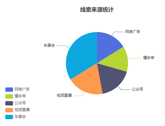
饼图模块
饼图用于展示分类数据的占比,例如线索来源分布。实现逻辑与漏斗图类似,基于 ECharts 的饼系列(pie)。
1. 准备DOM容器
<div id="sourcePieChart" style="width: 600px; height: 400px;">div>2. 实现静态图表
import * as echarts from 'echarts';
mounted() {
this.loadSourcePieChart();
},
methods: {
loadSourcePieChart() {
const chartDom = document.getElementById('sourcePieChart');
const myChart = echarts.init(chartDom);
const option = {
title: { text: 'Referer of a Website', subtext: 'Fake Data', left: 'center' },
tooltip: { trigger: 'item' },
legend: { orient: 'vertical', left: 'left' },
series: [
{
name: 'Access From',
type: 'pie',
radius: '50%',
data: [
{ value: 1048, name: 'Search Engine' },
{ value: 735, name: 'Direct' },
{ value: 580, name: 'Email' },
{ value: 484, name: 'Union Ads' },
{ value: 300, name: 'Video Ads' },
],
emphasis: {
itemStyle: {
shadowBlur: 10,
shadowOffsetX: 0,
shadowColor: 'rgba(0, 0, 0, 0.5)',
},
},
},
],
};
myChart.setOption(option);
},
},3. 实现动态图表
异步加载数据,直接绑定到 series.data:
data() {
  return {
    sourcePieData: [],
  };
},
methods: {
  loadSourcePieChart() {
    doGet("/api/sourcePie/data", {}).then((resp) => {
      if (resp.data.code === 200) {
        this.sourcePieData = resp.data.data;
        const chartDom = document.getElementById('sourcePieChart');
        const myChart = echarts.init(chartDom);
        const option = {
          title: { text: '线索来源统计', left: 'center' },
          tooltip: { trigger: 'item' },
          legend: { orient: 'vertical', left: 'left' },
          series: [
            {
              name: '来自',
              type: 'pie',
              radius: '50%',
              data: this.sourcePieData,
              emphasis: {
                itemStyle: {
                  shadowBlur: 10,
                  shadowOffsetX: 0,
                  shadowColor: 'rgba(0, 0, 0, 0.5)',
                },
              },
            },
          ],
        };
        myChart.setOption(option);
      }
    });
  },
},
4. 后端数据接口
前端逻辑完成,等待 /api/sourcePie/data 接口提供数组格式数据(如 [{value: 1048, name: '搜索引擎'}] )。
- 微信
- 赶快加我聊天吧

- 赶快加我聊天吧